ChartDiff: A Large-Scale Benchmark for Comprehending Pairs of Charts
Abstract
Charts are central to analytical reasoning, yet existing benchmarks for chart understanding focus almost exclusively on single-chart interpretation rather than comparative reasoning across multiple charts. To address this gap, we introduce ChartDiff, the first large-scale benchmark for cross-chart comparative summarization. ChartDiff consists of 8,541 chart pairs spanning diverse data sources, chart types, and visual styles, each annotated with LLM-generated and human-verified summaries describing differences in trends, fluctuations, and anomalies. Using ChartDiff, we evaluate general-purpose, chart-specialized, and pipeline-based models. Our results show that frontier general-purpose models achieve the highest GPT-based quality, while specialized and pipeline-based methods obtain higher ROUGE scores but lower human-aligned evaluation, revealing a clear mismatch between lexical overlap and actual summary quality. We further find that multi-series charts remain challenging across model families, whereas strong end-to-end models are relatively robust to differences in plotting libraries. Overall, our findings demonstrate that comparative chart reasoning remains a significant challenge for current vision-language models and position ChartDiff as a new benchmark for advancing research on multi-chart understanding.
ChartDiff: A Large-Scale Benchmark for Comprehending Pairs of Charts
Rongtian Ye Department of Computer Science, Aalto University rongtian.ye@aalto.fi https://ckchaos.github.io/ChartDiff
1 Introduction
Charts play a central role in analytical reasoning, communication, and decision-making. From scientific publications to business dashboards, chart presentations allow humans to quickly extract patterns, compare trends, and evaluate alternatives. As vision-language models (VLMs) Radford et al. (2021); Li et al. (2022); Liu et al. (2023c); Bai et al. (2023) continue to advance, enabling them to understand and explain charts Han et al. (2023); Masry et al. (2023); Zhang et al. (2024) has become an increasingly active research area. Recent progress has produced a variety of benchmarks and methods targeting tasks such as chart question answering Masry et al. (2022); Wang et al. (2024), chart summarization Kantharaj et al. (2022); Meng et al. (2024), structured information extraction Liu et al. (2023b, a). Despite these advances, existing work Masry et al. (2022, 2023); Han et al. (2023); Zhang et al. (2024); Masry et al. (2025a); Meng et al. (2024); Zhao et al. (2025); Xu et al. (2025) overwhelmingly focuses on single-chart understanding, treating each chart as an isolated unit.
However, many real-world analytical tasks are inherently comparative. Analysts routinely juxtapose multiple charts to evaluate differences across groups, time periods, experimental conditions, or modeling assumptions. Detecting how two charts differ—whether in their underlying data, visual encodings, statistical relationships, or narrative intent—is central to tasks such as anomaly detection, model comparison, A/B testing, monitoring system performance, or verifying the reproducibility of results. Yet, to date, though some works Zhu et al. (2025); Iyengar et al. (2025); Kazemi et al. (2024) have been proposed in multi-chart setting, the ability of VLMs to perform such comparative reasoning remains largely unexplored.

Chart A (Left)

Chart B (Right)
Comparison Summary: From 2000 to 2009, Maldives maintained a high and fairly stable tariff around 20–21%, while Venezuela showed a clear downward trend from 13.37% to 9.09% with only minor fluctuations. In 2010–2019, Maldives changed much more dramatically: after staying near 20% in 2010–2011, its tariff collapsed to 6.45% in 2012, then gradually recovered through the decade before rebounding sharply to 18.39% in 2019. Venezuela, by contrast, remained relatively steady in the later period, mostly fluctuating within a narrower 8.4–11.0% range after its earlier decline. Overall, the key shift is that Maldives moved from stability to major volatility and structural change, whereas Venezuela moved from a steady decline to a comparatively stable low-tariff pattern.
To address this gap, we introduce a new large-scale benchmark ChartDiff (Dataset illustration in Figure 1) designed specifically for cross-chart difference comprehension. ChartDiff comprises 8,541 pairs of charts, covering a wide range of data sources, visualization types, and styles. For each pair, we provide LLM-generated and human-verified annotations describing differences in trends, fluctuations, and anomalies. These annotations form a rigorous testbed for evaluating whether VLMs can move beyond single-image interpretation and engage in comparative visual reasoning.
Using this benchmark, we conduct the first systematic evaluation of state-of-the-art VLMs on the task of cross-chart comparative summarization. Our experiments show that, while these models can achieve comparable performance on classic metrics Lin (2004), their performance varies significantly on modern metrics Fu et al. (2024). Some models struggle with poor reasoning abilities.
Our contributions are in two aspects:
-
•
We introduce the first benchmark ChartDiff on cross-chart comparative summarization, consisting of 8,541 annotated chart pairs with high diversity.
-
•
We evaluate various modern VLMs on cross-chart comparative summarization to illustrate the great progress of new VLMs and provide new insights into the challenges of chart understanding.
We hope this work catalyzes future research on multi-chart reasoning, an ability that is essential for supporting real-world visual analytics workflows yet remains underrepresented in current model capabilities and benchmarks.
2 Related Works
2.1 Vision-Language Models for Chart Understanding
VLMs have made rapid progress in chart understanding, and existing approaches can be broadly divided into general-purpose multimodal models and chart-specialized models. General-purpose models such as GPT systems OpenAI et al. (2024); Singh et al. (2025), Gemini series Comanici et al. (2025), Qwen3.5 Qwen Team (2026), and InternVL Chen et al. (2024) exhibit strong visual reasoning abilities and can handle a wide range of chart-related tasks without task-specific training. In contrast, chart-specialized models, including ChartLlama Han et al. (2023), UniChart Masry et al. (2023), ChartAssistant Meng et al. (2024), and ChartGemma Masry et al. (2025b) are typically trained via visual instruction tuning Liu et al. (2023c) or multitask learning to better capture chart structures and semantics. Some works further extend encoder-decoder frameworks, such as Matcha Liu et al. (2023b) built upon Pix2Struct Lee et al. (2023), by incorporating chart data extraction and mathematical reasoning capabilities. While these models achieve strong performance on tasks like chart question answering and summarization, they are often limited by task-specific tuning and predefined pipelines, which restrict their ability to generalize to diverse chart types and complex reasoning scenarios.
Recent work focuses on improving reasoning for chart understanding. TinyChart Zhang et al. (2024) adopts Program-of-Thought prompting Chen et al. (2023), while ChartCoder Zhao et al. (2025) and ChartReasoner Jia et al. (2025) leverage chart-to-code generation for multi-step inference. Chart-R1 Chen et al. (2026) and Chart-RL Zhang et al. (2026) further incorporates reinforcement learning to enhance reasoning quality. However, these approaches depend on intermediate representations such as code or templates, making them sensitive to upstream errors and limiting robustness, as highlighted by works like ChartMimic Yang et al. (2025) and ChartMoE Xu et al. (2025).
2.2 Benchmarks for Chart Understanding
A wide range of benchmarks have been proposed to evaluate chart understanding capabilities of VLMs. Early datasets such as FigureQA Kahou et al. (2017), DVQA Kafle et al. (2018), and PlotQA Methani et al. (2020) primarily rely on synthetic charts and template-based questions, which constrain both visual diversity and reasoning complexity. Subsequent efforts, including ChartQA Masry et al. (2022) and Chart-to-Text Kantharaj et al. (2022), shift toward real-world data and more natural language queries, enabling evaluation of higher-level tasks such as question answering and summarization. More recent benchmarks, such as ChartX Xia et al. (2024) and ChartBench Xu et al. (2023), further expand chart diversity and task coverage. Despite these advances, most existing benchmarks are designed around single-chart settings, where models process one visualization at a time without considering relationships across multiple charts.
To address increasing model capabilities, several works introduce more challenging tasks and broader evaluation protocols. Benchmarks like CharXiv Wang et al. (2024) and SciGraphQA Li and Tajbakhsh (2023) emphasize complex reasoning, multi-turn interactions, or domain-specific knowledge, while ChartQAPro Masry et al. (2025a) and MMMU Yue et al. (2024) explore more diverse question types and multimodal reasoning scenarios. However, these benchmarks still predominantly evaluate understanding within a single chart, focusing on tasks such as data extraction, description, or localized reasoning. As a result, they fail to capture a critical real-world requirement: comparing and synthesizing information across multiple visualizations, which often involves aligning semantics, identifying differences, and aggregating trends.
Only a limited number of benchmarks begin to explore multi-chart or cross-chart reasoning. For example, MultiChartQA Zhu et al. (2025) introduces multi-hop reasoning across related charts, while INTERCHART Iyengar et al. (2025) investigates cross-chart understanding under controlled settings. ReMI Kazemi et al. (2024) also includes a small subset of multi-chart scenarios. Nevertheless, these datasets are relatively small in scale or limited in task design, leaving substantial gaps in evaluating comprehensive cross-chart reasoning. To bridge this gap, we propose ChartDiff, a large-scale benchmark for cross-chart comparative summarization, consisting of 8,541 chart pairs. Notably, ChartAB Bansal et al. (2025) presents a dataset of comparable scale, but focuses on a diagnostic framework centered on grounding, alignment, and robustness, emphasizing fine-grained pairwise difference identification rather than holistic comparative summarization. In contrast, ChartDiff explicitly targets comparative reasoning by requiring models to identify differences in trends, fluctuations, and anomalies across charts and to generate coherent summaries, offering an additional perspective for evaluating chart understanding in multi-chart scenarios.
3 Dataset Construction
In this section, we describe the construction pipeline of ChartDiff. We begin by collecting raw data from real-world sources, followed by preprocessing to prepare the data for chart rendering. Finally, we construct chart pairs and apply an annotation pipeline to produce comparison summaries.
3.1 Raw Data Collection and Processing
We collect tabular time-series data from publicly available sources, including Macrotrends Macrotrends LLC (2026), Yahoo Finance Yahoo Finance (2026), and Visual Crossing Visual Crossing Corporation (2026). The collected data spans eight domains: economy, health, immigration, labor force, population, trade, stock markets, and weather. In total, the dataset covers approximately 200 countries or regions, 100 cities, and 100 publicly traded stocks.
We first filter out datasets with discontinuous or incomplete time series to ensure data quality. We then perform data sampling and construct pairs of datasets for comparison. To ensure that each pair reflects a meaningful and controlled difference, we constrain paired datasets to differ along only one of the following three aspects: (1) data entity (e.g., different countries or stocks), (2) time span, or (3) data category.
After pairing, each pair consists of two CSV datasets, which are used to generate a pair of charts for subsequent comparison and annotation.
3.2 Chart Rendering
To generate visualizations, we utilize three widely used Python plotting libraries: Matplotlib Hunter (2007), Plotly Plotly Technologies Inc. (2015), and Plotnine Hassan Kibirige (2026). For each library, we design multiple styling configurations to enhance visual diversity, resulting in approximately 60 distinct visualization styles in total.
ChartDiff includes six chart categories: line charts, bar charts, horizontal bar charts, multi-series line charts111A multi-series chart is defined as a visualization where the underlying CSV data contains multiple distinct value columns. An example pair of multi-series line charts is shown in Figure 6, and an example pair of multi-series bar charts is shown in Figure 7., multi-series bar charts, and pie charts. These chart types cover a wide range of common visualization scenarios, including temporal trends, categorical comparisons, and proportional distributions.
To ensure high-quality visualizations, all generated charts undergo manual inspection. We verify the absence of common visualization issues, including legend occlusion, missing or improperly rendered data points, inconsistent axis scaling, and other artifacts that could hinder accurate interpretation.
3.3 Annotation Pipeline
To produce high-quality comparison summaries, we employ a multi-stage annotation pipeline leveraging large language models (LLMs). The pipeline follows an annotate–judge–verify paradigm for each chart pair.
First, we define a pool of LLMs . For each chart pair , we randomly sample an annotator model and prompt it with a carefully designed instruction(Figure 11) to generate a candidate comparison summary . We provide only the underlying CSV data of the charts to ensure accurate and consistent analysis.
Next, we sample a second model to act as a judge. Given the same chart pair and the candidate summary , evaluates whether is accurate and acceptable according to a predefined evaluation prompt(Figure 12), and decides whether to accept or reject it. For accepted summaries, the words “Dataset” and “dataset” are replaced with “Chart” and “chart”, respectively.
Finally, all accepted summaries undergo manual verification to ensure quality. During this stage, we check for factual correctness, completeness of key differences, and overall clarity, filtering out any remaining low-quality or ambiguous annotations.
3.4 Dataset Curation Details
For data pairing, we sample between 6 and 12 data points for each dataset across all chart types, except for pie charts, and ensure that the two datasets in each pair contain the same number of data points. For pie charts, we restrict each dataset to 3–5 categories to maintain clear and interpretable proportional comparisons.
For chart rendering, we randomly select a visualization style from a set of predefined styling configurations for each pair, and both charts in the pair share the same styling configuration.
In the annotation pipeline, we employ a pool of LLMs, including GPT-5.4 Singh et al. (2025) and Gemini 3.1 Pro Google Deepmind (2026b). The acceptance rate of candidate summaries generated by GPT-5.4 is 0.93, while that of Gemini 3.1 Pro is 0.967, indicating a high level of annotation quality.
After completing the three-stage pipeline, we obtain a total of 8,541 chart pairs with high-quality comparison annotations. The distribution of samples across different chart types is summarized in Table 1.
Each chart is rendered at a resolution of pixels. We further split ChartDiff into training, validation, and test sets containing 6,041, 1,000, and 1,500 chart pairs, respectively.
| Chart Type | Pairs | Percentage |
|---|---|---|
| Line | 2257 | 26.4% |
| Bar | 2153 | 25.2% |
| Horizontal Bar | 679 | 8.0% |
| Line (Multi-series) | 1044 | 12.2% |
| Bar (Multi-series) | 1072 | 12.6% |
| Pie | 1336 | 15.6% |
4 Experiments
4.1 Models
We evaluate a diverse set of models spanning four categories:
General-Purpose Closed-Source Models. We include state-of-the-art proprietary VLMs, including GPT-5.4 Singh et al. (2025), Gemini 3.1 Pro Google Deepmind (2026b), GPT-5.4-mini Singh et al. (2025), Gemini 3.1 Flash Lite Google Deepmind (2026a), Claude Sonnet 4.6 Anthropic (2026), and GPT-4o OpenAI et al. (2024).
General-Purpose Open-Source Models. We consider representative open-source models, including Qwen3.5-397B-A17B Qwen Team (2026), Qwen3.5-9B Qwen Team (2026), and Qwen2.5-VL-7B Bai et al. (2025).
Chart-Domain Specialized Models. We evaluate models specifically designed for chart understanding, including ChartGemma Masry et al. (2025b) and MatCha Liu et al. (2023b).
Pipeline-Based Methods. In addition to end-to-end models, we evaluate a pipeline-based approach that first extracts structured data from charts and then performs comparison using an LLM. Specifically, we use DePlot Liu et al. (2023a) as the chart-to-table extractor, followed by GPT-5.4 Singh et al. (2025) or Qwen3.5-9B Qwen Team (2026) for comparison generation.
4.2 Evaluation Metrics
We adopt two complementary evaluation metrics:
ROUGE. We use ROUGE Lin (2004) as a standard lexical-overlap metric to measure similarity between generated summaries and reference annotations.
GPT Score. We further employ a model-based evaluation metric, GPT Score Fu et al. (2024), using GPT-5.4 Singh et al. (2025) as the judge model to assess the quality of generated summaries with a predefined grading prompt (Figure 16 and Figure 17).
To validate the reliability of GPT Score, we randomly sample 300 comparison summaries generated by different models and obtain human ratings using the same evaluation criteria as the grading prompt (Figure 16 and Figure 17). We observe a Pearson correlation coefficient of 0.91 between human scores and GPT scores, indicating strong agreement.
| Models | ROUGE-1 | ROUGE-2 | ROUGE-L | GPT Score |
|---|---|---|---|---|
| General-Purpose Closed-Source Models | ||||
| GPT-5.4 Singh et al. (2025) | 46.02 | 12.28 | 23.45 | 4.95 |
| Gemini 3.1 Pro Google Deepmind (2026b) | 47.21 | 13.48 | 24.2 | 4.86 |
| GPT-5.4-mini Singh et al. (2025) | 43.0 | 10.62 | 21.68 | 4.82 |
| Gemini 3.1 Flash LiteGoogle Deepmind (2026a) | 46.37 | 12.83 | 22.82 | 4.63 |
| Claude Sonnet 4.6 Anthropic (2026) | 47.54 | 13.31 | 23.42 | 4.58 |
| GPT-4o OpenAI et al. (2024) | 44.43 | 11.48 | 22.44 | 4.23 |
| General-Purpose Open-Source Models | ||||
| Qwen3.5-397B-A17B Qwen Team (2026) | 47.07 | 12.68 | 22.57 | 4.54 |
| Qwen3.5-9B Qwen Team (2026) | 44.09 | 10.84 | 21.16 | 3.65 |
| Qwen2.5VL-7B Bai et al. (2025) | 41.18 | 9.82 | 20.88 | 3.18 |
| Chart-Domain Specialized Models | ||||
| ChartGemma Masry et al. (2025b) | 51.49 | 17.81 | 28.53 | 2.0 |
| MatCha Liu et al. (2023b) | 49.52 | 18.34 | 28.75 | 1.45 |
| Pipeline-Based Methods | ||||
| Deplot Liu et al. (2023a) + GPT-5.4 | 50.75 | 17.25 | 28.88 | 3.58 |
| Deplot + GPT-4o | 46.46 | 13.19 | 23.66 | 3.38 |
| Deplot + Qwen3.5-9B | 43.1 | 10.38 | 20.3 | 2.81 |
| Random | 25.5 | 2.5 | 12.81 | 1.17 |
| Models | GPT Score | ||||||
|---|---|---|---|---|---|---|---|
| Overall | Chart Type | ||||||
| Line | Bar | Bar(H.) | Line(M.) | Bar(M.) | Pie | ||
| General-Purpose Closed-Source Models | |||||||
| GPT-5.4 Singh et al. (2025) | 4.95 | 4.97 | 4.97 | 4.89 | 4.9 | 4.88 | 4.99 |
| Gemini 3.1 Pro Google Deepmind (2026b) | 4.86 | 4.82 | 4.9 | 4.94 | 4.65 | 4.85 | 4.98 |
| GPT-5.4-mini Singh et al. (2025) | 4.82 | 4.86 | 4.82 | 4.75 | 4.74 | 4.78 | 4.85 |
| Gemini 3.1 Flash Lite Google Deepmind (2026a) | 4.63 | 4.65 | 4.66 | 4.67 | 4.33 | 4.47 | 4.87 |
| Claude Sonnet 4.6 Anthropic (2026) | 4.58 | 4.54 | 4.6 | 4.57 | 4.38 | 4.46 | 4.87 |
| GPT-4o OpenAI et al. (2024) | 4.23 | 4.23 | 4.32 | 3.85 | 3.88 | 3.78 | 4.85 |
| General-Purpose Open-Source Models | |||||||
| Qwen3.5-397B-A17B Qwen Team (2026) | 4.54 | 4.59 | 4.58 | 4.36 | 4.41 | 4.35 | 4.72 |
| Qwen3.5-9B Qwen Team (2026) | 3.65 | 3.82 | 3.89 | 3.55 | 3.2 | 3.33 | 3.57 |
| Qwen2.5VL-7B Bai et al. (2025) | 3.18 | 3.54 | 3.14 | 2.79 | 2.79 | 2.53 | 3.58 |
| Chart-Domain Specialized Models | |||||||
| ChartGemma Masry et al. (2025b) | 2.0 | 2.36 | 2.36 | 2.01 | 1.3 | 1.36 | 1.68 |
| MatCha Liu et al. (2023b) | 1.45 | 1.62 | 1.69 | 1.43 | 0.92 | 0.99 | 1.47 |
| Pipeline-Based Methods | |||||||
| Deplot Liu et al. (2023a) + GPT-5.4 | 3.58 | 3.89 | 4.63 | 3.16 | 2.91 | 4.65 | 1.24 |
| Deplot + GPT-4o | 3.38 | 3.68 | 4.32 | 3.23 | 2.77 | 4.21 | 1.27 |
| Deplot + Qwen3.5-9B | 2.81 | 3.16 | 3.8 | 2.16 | 2.3 | 3.44 | 0.79 |
| Random | 1.17 | 1.23 | 1.5 | 1.52 | 1.28 | 1.24 | 0.21 |
| Models | Overall | Plotting Libraries | ||
|---|---|---|---|---|
| Matplotlib | Plotly | Plotnine | ||
| GPT-5.4 | 4.95 | 4.94 | 4.97 | 4.93 |
| Qwen3.5-397B-A17B | 4.54 | 4.51 | 4.63 | 4.44 |
| ChartGemma | 2.0 | 2.06 | 1.99 | 1.95 |
| Deplot + GPT-5.4 | 3.58 | 4.08 | 3.12 | 3.89 |
4.3 Implementation Details
For all models, we concatenate the two charts horizontally into a single combined image as the model input.
For general-purpose models, we evaluate performance in a zero-shot setting without task-specific fine-tuning. We directly prompt the models (Figure 13) to generate comparison summaries.
4.4 Analysis
Overall. Table 2 shows that general-purpose closed-source models achieve the best overall generation quality, with GPT-5.4 Singh et al. (2025) obtaining the highest GPT Score (4.95), followed by Gemini 3.1 Pro Google Deepmind (2026b) (4.86). In contrast, chart-domain specialized models and pipeline-based methods achieve the strongest ROUGE scores, with ChartGemma Masry et al. (2025b) reaching the highest ROUGE-1 (51.49), MatCha Liu et al. (2023b) the best ROUGE-2 (18.34) and ROUGE-L (28.75), and Deplot Liu et al. (2023a) + GPT-5.4 also performing strongly on all ROUGE metrics. However, these models obtain much lower GPT Scores, indicating a substantial mismatch between lexical overlap and human-aligned generation quality. Among open-source models, Qwen3.5-397B-A17B Qwen Team (2026) is the strongest, achieving competitive ROUGE scores and a GPT Score of 4.54, though it still trails the best proprietary systems. Overall, the results suggest that while specialized and pipeline-based approaches are advantageous for reference matching, frontier general-purpose LLMs produce more natural and better-evaluated chart descriptions, highlighting the importance of complementing lexical overlap-based metrics with quality-oriented evaluation metrics.
Chart type. Table 3 shows clear performance differences across chart types. Pie charts are generally the easiest for general-purpose LLMs, with nearly all closed-source models achieving very high GPT Scores on this type. Simple line and bar charts are also handled well, while multi-series charts are more challenging, as performance tends to drop across most model families. This pattern is particularly evident for smaller open-source and chart-specialized models, whose scores decrease substantially on multi-series charts. In contrast, pipeline-based methods perform relatively well on bar and multi-series bar charts but fail badly on pie charts, suggesting that their effectiveness is highly dependent on chart structure, possibly because DePlot was not pretrained on pie charts. Overall, the results indicate that chart complexity is a major factor in chart-to-text generation, with multi-series charts remaining the most difficult cases.
Plotting library. Table 4 shows that performance is generally stable across plotting libraries for strong end-to-end models, suggesting that library-specific rendering differences have limited impact on top-performing LLMs. For example, GPT-5.4 Singh et al. (2025) maintains nearly identical GPT Scores on Matplotlib (4.94), Plotly (4.97), and Plotnine (4.93), while Qwen3.5-397B-A17B also shows only moderate variation across libraries. Among the three libraries, Plotly appears slightly easier for general-purpose models, yielding the highest scores for both GPT-5.4 and Qwen3.5-397B-A17B Qwen Team (2026). In contrast, pipeline-based methods are more sensitive to library choice: Deplot Liu et al. (2023a) + GPT-5.4 performs best on Matplotlib (4.08) and Plotnine (3.89) but drops noticeably on Plotly (3.12). Overall, the results suggest that plotting library has only a minor effect for strong end-to-end LLMs, but can substantially affect modular pipeline approaches.
5 Conclusion
We present ChartDiff, the first large-scale benchmark for cross-chart comparative summarization, consisting of 8,541 chart pairs with high-quality comparison annotations. Our evaluation shows that although modern vision-language models have become strong at single-chart understanding, they still face clear challenges in comparative chart reasoning, especially on structurally complex chart types such as multi-series charts. We further find a substantial mismatch between lexical-overlap metrics and GPT-based quality evaluation, suggesting that chart comparison should be assessed with more than overlap-based metrics alone. We hope ChartDiff will provide a useful foundation for future research on multi-chart understanding and comparative visual reasoning.
Limitations
Our work has several limitations. ChartDiff covers only a subset of common chart types and may not generalize to more complex real-world visualizations. Although annotations are human-verified, they are partially LLM-generated and may reflect annotation bias. In addition, our main evaluation relies on GPT-Score, which, despite strong correlation with human judgment, is still an imperfect automatic evaluator. Finally, we focus on open-ended comparative summarization rather than other multi-chart reasoning tasks, leaving broader comparative understanding for future work.
Ethics Statement
ChartDiff is constructed from publicly available data and synthetically generated charts and does not contain personal or sensitive information. The dataset is intended for research purposes only. We note that models evaluated on this benchmark may generate incorrect or misleading summaries, and therefore should not be used in high-stakes applications without human verification. We encourage responsible use of the dataset and future work on improving the reliability and safety of chart understanding systems.
References
- Anthropic (2026) Anthropic. 2026. Claude sonnet 4.6,. Accessed: 2026-03-18.
- Bai et al. (2023) Jinze Bai, Shuai Bai, Shusheng Yang, Shijie Wang, Sinan Tan, Peng Wang, Junyang Lin, Chang Zhou, and Jingren Zhou. 2023. Qwen-vl: A versatile vision-language model for understanding, localization, text reading, and beyond. arXiv preprint arXiv:2308.12966.
- Bai et al. (2025) Shuai Bai, Keqin Chen, Xuejing Liu, Jialin Wang, Wenbin Ge, Sibo Song, Kai Dang, Peng Wang, Shijie Wang, Jun Tang, Humen Zhong, Yuanzhi Zhu, Mingkun Yang, Zhaohai Li, Jianqiang Wan, Pengfei Wang, Wei Ding, Zheren Fu, Yiheng Xu, and 8 others. 2025. Qwen2.5-vl technical report. ArXiv, abs/2502.13923.
- Bansal et al. (2025) Aniruddh Bansal, Davit Soselia, Dang Nguyen, and Tianyi Zhou. 2025. Chartab: A benchmark for chart grounding & dense alignment. Preprint, arXiv:2510.26781.
- Chen et al. (2026) Lei Chen, Xuanle Zhao, Zhixiong Zeng, Jing Huang, Yufeng Zhong, and Lin Ma. 2026. Chart-r1: Chain-of-thought supervision and reinforcement for advanced chart reasoner. Preprint, arXiv:2507.15509.
- Chen et al. (2023) Wenhu Chen, Xueguang Ma, Xinyi Wang, and William W. Cohen. 2023. Program of thoughts prompting: Disentangling computation from reasoning for numerical reasoning tasks. Transactions on Machine Learning Research.
- Chen et al. (2024) Zhe Chen, Jiannan Wu, Wenhai Wang, Weijie Su, Guo Chen, Sen Xing, Muyan Zhong, Qinglong Zhang, Xizhou Zhu, Lewei Lu, and 1 others. 2024. Internvl: Scaling up vision foundation models and aligning for generic visual-linguistic tasks. In Proceedings of the IEEE/CVF Conference on Computer Vision and Pattern Recognition, pages 24185–24198.
- Comanici et al. (2025) Gheorghe Comanici, Eric Bieber, Mike Schaekermann, Ice Pasupat, Noveen Sachdeva, Inderjit Dhillon, Marcel Blistein, Ori Ram, Dan Zhang, Evan Rosen, Luke Marris, Sam Petulla, Colin Gaffney, Asaf Aharoni, Nathan Lintz, Tiago Cardal Pais, Henrik Jacobsson, Idan Szpektor, Nan-Jiang Jiang, and 3416 others. 2025. Gemini 2.5: Pushing the frontier with advanced reasoning, multimodality, long context, and next generation agentic capabilities. Preprint, arXiv:2507.06261.
- Fu et al. (2024) Jinlan Fu, See-Kiong Ng, Zhengbao Jiang, and Pengfei Liu. 2024. GPTScore: Evaluate as you desire. In Proceedings of the 2024 Conference of the North American Chapter of the Association for Computational Linguistics: Human Language Technologies (Volume 1: Long Papers), pages 6556–6576, Mexico City, Mexico. Association for Computational Linguistics.
- Google Deepmind (2026a) Google Deepmind. 2026a. Gemini 3.1 flash lite. Accessed: 2026-03-18.
- Google Deepmind (2026b) Google Deepmind. 2026b. Gemini 3.1 pro. Accessed: 2026-03-18.
- Han et al. (2023) Yucheng Han, Chi Zhang, Xin Chen, Xu Yang, Zhibin Wang, Gang Yu, Bin Fu, and Hanwang Zhang. 2023. Chartllama: A multimodal llm for chart understanding and generation. Preprint, arXiv:2311.16483.
- Hassan Kibirige (2026) Hassan Kibirige. 2026. plotnine. Accessed: 2026-08.
- Hunter (2007) J. D. Hunter. 2007. Matplotlib: A 2d graphics environment. Computing in Science & Engineering, 9(3):90–95.
- Iyengar et al. (2025) Anirudh Iyengar Kaniyar Narayana Iyengar, Srija Mukhopadhyay, Adnan Qidwai, Shubhankar Singh, Dan Roth, and Vivek Gupta. 2025. INTERCHART: Benchmarking visual reasoning across decomposed and distributed chart information. In Proceedings of the 14th International Joint Conference on Natural Language Processing and the 4th Conference of the Asia-Pacific Chapter of the Association for Computational Linguistics, pages 2046–2067, Mumbai, India. The Asian Federation of Natural Language Processing and The Association for Computational Linguistics.
- Jia et al. (2025) Caijun Jia, Nan Xu, Jingxuan Wei, Qingli Wang, Lei Wang, Bihui Yu, and Junnan Zhu. 2025. Chartreasoner: Code-driven modality bridging for long-chain reasoning in chart question answering. Preprint, arXiv:2506.10116.
- Kafle et al. (2018) Kushal Kafle, Scott Cohen, Brian Price, and Christopher Kanan. 2018. Dvqa: Understanding data visualizations via question answering. In CVPR.
- Kahou et al. (2017) Samira Ebrahimi Kahou, Adam Atkinson, Vincent Michalski, Ákos Kádár, Adam Trischler, and Yoshua Bengio. 2017. Figureqa: An annotated figure dataset for visual reasoning. ArXiv, abs/1710.07300.
- Kantharaj et al. (2022) Shankar Kantharaj, Rixie Tiffany Leong, Xiang Lin, Ahmed Masry, Megh Thakkar, Enamul Hoque, and Shafiq Joty. 2022. Chart-to-text: A large-scale benchmark for chart summarization. In Proceedings of the 60th Annual Meeting of the Association for Computational Linguistics (Volume 1: Long Papers), pages 4005–4023, Dublin, Ireland. Association for Computational Linguistics.
- Kazemi et al. (2024) Mehran Kazemi, Nishanth Dikkala, Ankit Anand, Petar Devic, Ishita Dasgupta, Fangyu Liu, Bahare Fatemi, Pranjal Awasthi, Dee Guo, Sreenivas Gollapudi, and Ahmed Qureshi. 2024. Remi: a dataset for reasoning with multiple images. In Proceedings of the 38th International Conference on Neural Information Processing Systems, NIPS ’24, Red Hook, NY, USA. Curran Associates Inc.
- Lee et al. (2023) Kenton Lee, Mandar Joshi, Iulia Turc, Hexiang Hu, Fangyu Liu, Julian Eisenschlos, Urvashi Khandelwal, Peter Shaw, Ming-Wei Chang, and Kristina Toutanova. 2023. Pix2struct: screenshot parsing as pretraining for visual language understanding. In Proceedings of the 40th International Conference on Machine Learning, ICML’23. JMLR.org.
- Li et al. (2022) Junnan Li, Dongxu Li, Caiming Xiong, and Steven Hoi. 2022. Blip: Bootstrapping language-image pre-training for unified vision-language understanding and generation. Proceedings of Machine Learning Research, 162:12888–12900. Publisher Copyright: Copyright © 2022 by the author(s); 39th International Conference on Machine Learning, ICML 2022 ; Conference date: 17-07-2022 Through 23-07-2022.
- Li and Tajbakhsh (2023) Shengzhi Li and Nima Tajbakhsh. 2023. Scigraphqa: A large-scale synthetic multi-turn question-answering dataset for scientific graphs. CoRR, abs/2308.03349.
- Lin (2004) Chin-Yew Lin. 2004. ROUGE: A package for automatic evaluation of summaries. In Text Summarization Branches Out, pages 74–81, Barcelona, Spain. Association for Computational Linguistics.
- Liu et al. (2023a) Fangyu Liu, Julian Eisenschlos, Francesco Piccinno, Syrine Krichene, Chenxi Pang, Kenton Lee, Mandar Joshi, Wenhu Chen, Nigel Collier, and Yasemin Altun. 2023a. DePlot: One-shot visual language reasoning by plot-to-table translation. In Findings of the Association for Computational Linguistics: ACL 2023, pages 10381–10399, Toronto, Canada. Association for Computational Linguistics.
- Liu et al. (2023b) Fangyu Liu, Francesco Piccinno, Syrine Krichene, Chenxi Pang, Kenton Lee, Mandar Joshi, Yasemin Altun, Nigel Collier, and Julian Eisenschlos. 2023b. MatCha: Enhancing visual language pretraining with math reasoning and chart derendering. In Proceedings of the 61st Annual Meeting of the Association for Computational Linguistics (Volume 1: Long Papers), pages 12756–12770, Toronto, Canada. Association for Computational Linguistics.
- Liu et al. (2023c) Haotian Liu, Chunyuan Li, Qingyang Wu, and Yong Jae Lee. 2023c. Visual instruction tuning. In NeurIPS.
- Macrotrends LLC (2026) Macrotrends LLC. 2026. Macrotrends data downloads. Accessed: 2025-08.
- Masry et al. (2025a) Ahmed Masry, Mohammed Saidul Islam, Mahir Ahmed, Aayush Bajaj, Firoz Kabir, Aaryaman Kartha, Md Tahmid Rahman Laskar, Mizanur Rahman, Shadikur Rahman, Mehrad Shahmohammadi, Megh Thakkar, Md Rizwan Parvez, Enamul Hoque, and Shafiq Joty. 2025a. ChartQAPro: A more diverse and challenging benchmark for chart question answering. In Findings of the Association for Computational Linguistics: ACL 2025, pages 19123–19151, Vienna, Austria. Association for Computational Linguistics.
- Masry et al. (2023) Ahmed Masry, Parsa Kavehzadeh, Xuan Long Do, Enamul Hoque, and Shafiq Joty. 2023. UniChart: A universal vision-language pretrained model for chart comprehension and reasoning. In Proceedings of the 2023 Conference on Empirical Methods in Natural Language Processing, pages 14662–14684, Singapore. Association for Computational Linguistics.
- Masry et al. (2022) Ahmed Masry, Do Long, Jia Qing Tan, Shafiq Joty, and Enamul Hoque. 2022. ChartQA: A benchmark for question answering about charts with visual and logical reasoning. In Findings of the Association for Computational Linguistics: ACL 2022, pages 2263–2279, Dublin, Ireland. Association for Computational Linguistics.
- Masry et al. (2025b) Ahmed Masry, Megh Thakkar, Aayush Bajaj, Aaryaman Kartha, Enamul Hoque, and Shafiq Joty. 2025b. ChartGemma: Visual instruction-tuning for chart reasoning in the wild. In Proceedings of the 31st International Conference on Computational Linguistics: Industry Track, pages 625–643, Abu Dhabi, UAE. Association for Computational Linguistics.
- Meng et al. (2024) Fanqing Meng, Wenqi Shao, Quanfeng Lu, Peng Gao, Kaipeng Zhang, Yu Qiao, and Ping Luo. 2024. ChartAssistant: A universal chart multimodal language model via chart-to-table pre-training and multitask instruction tuning. In Findings of the Association for Computational Linguistics: ACL 2024, pages 7775–7803, Bangkok, Thailand. Association for Computational Linguistics.
- Methani et al. (2020) Nitesh Methani, Pritha Ganguly, Mitesh M. Khapra, and Pratyush Kumar. 2020. Plotqa: Reasoning over scientific plots. In The IEEE Winter Conference on Applications of Computer Vision (WACV).
- OpenAI et al. (2024) OpenAI, :, Aaron Hurst, Adam Lerer, Adam P. Goucher, Adam Perelman, Aditya Ramesh, Aidan Clark, AJ Ostrow, Akila Welihinda, Alan Hayes, Alec Radford, Aleksander Mądry, Alex Baker-Whitcomb, Alex Beutel, Alex Borzunov, Alex Carney, Alex Chow, Alex Kirillov, and 401 others. 2024. Gpt-4o system card. Preprint, arXiv:2410.21276.
- Plotly Technologies Inc. (2015) Plotly Technologies Inc. 2015. Collaborative data science.
- Qwen Team (2026) Qwen Team. 2026. Qwen3.5: Towards native multimodal agents.
- Radford et al. (2021) Alec Radford, Jong Wook Kim, Chris Hallacy, Aditya Ramesh, Gabriel Goh, Sandhini Agarwal, Girish Sastry, Amanda Askell, Pamela Mishkin, Jack Clark, Gretchen Krueger, and Ilya Sutskever. 2021. Learning transferable visual models from natural language supervision. Preprint, arXiv:2103.00020.
- Singh et al. (2025) Aaditya Singh, Adam Fry, Adam Perelman, Adam Tart, Adi Ganesh, Ahmed El-Kishky, Aidan McLaughlin, Aiden Low, AJ Ostrow, Akhila Ananthram, Akshay Nathan, Alan Luo, Alec Helyar, Aleksander Madry, Aleksandr Efremov, Aleksandra Spyra, Alex Baker-Whitcomb, Alex Beutel, Alex Karpenko, and 465 others. 2025. Openai gpt-5 system card. Preprint, arXiv:2601.03267.
- Visual Crossing Corporation (2026) Visual Crossing Corporation. 2026. Visual crossing weather (2021–2023). https://www.visualcrossing.com/. [data service]Accessed: 2025-08.
- Wang et al. (2024) Zirui Wang, Mengzhou Xia, Luxi He, Howard Chen, Yitao Liu, Richard Zhu, Kaiqu Liang, Xindi Wu, Haotian Liu, Sadhika Malladi, Alexis Chevalier, Sanjeev Arora, and Danqi Chen. 2024. Charxiv: Charting gaps in realistic chart understanding in multimodal llms. In Advances in Neural Information Processing Systems, volume 37, pages 113569–113697. Curran Associates, Inc.
- Xia et al. (2024) Renqiu Xia, Bo Zhang, Hancheng Ye, Xiangchao Yan, Qi Liu, Hongbin Zhou, Zijun Chen, Min Dou, Botian Shi, Junchi Yan, and Yu Qiao. 2024. Chartx and chartvlm: A versatile benchmark and foundation model for complicated chart reasoning. IEEE Transactions on Image Processing, 34:7436–7447.
- Xu et al. (2023) Zhengzhuo Xu, Sinan Du, Yiyan Qi, Chengjin Xu, Chun Yuan, and Jian Guo. 2023. Chartbench: A benchmark for complex visual reasoning in charts. CoRR, abs/2312.15915.
- Xu et al. (2025) Zhengzhuo Xu, Bowen Qu, Yiyan Qi, Sinan Du, Chengjin Xu, Chun Yuan, and Jian Guo. 2025. Chartmoe: Mixture of diversely aligned expert connector for chart understanding. In The Thirteenth International Conference on Learning Representations, ICLR 2025, Singapore, April 24-28, 2025. OpenReview.net.
- Yahoo Finance (2026) Yahoo Finance. 2026. Historical data for 100 stocks. https://finance.yahoo.com. Accessed: 2025-08.
- Yang et al. (2025) Cheng Yang, Chufan Shi, Yaxin Liu, Bo Shui, Junjie Wang, Mohan Jing, Linran Xu, Xinyu Zhu, Siheng Li, Yuxiang Zhang, Gongye Liu, Xiaomei Nie, Deng Cai, and Yujiu Yang. 2025. Chartmimic: Evaluating lmm’s cross-modal reasoning capability via chart-to-code generation. In The Thirteenth International Conference on Learning Representations, ICLR 2025, Singapore, April 24-28, 2025. OpenReview.net.
- Yue et al. (2024) Xiang Yue, Yuansheng Ni, Kai Zhang, Tianyu Zheng, Ruoqi Liu, Ge Zhang, Samuel Stevens, Dongfu Jiang, Weiming Ren, Yuxuan Sun, Cong Wei, Botao Yu, Ruibin Yuan, Renliang Sun, Ming Yin, Boyuan Zheng, Zhenzhu Yang, Yibo Liu, Wenhao Huang, and 3 others. 2024. Mmmu: A massive multi-discipline multimodal understanding and reasoning benchmark for expert agi. In Proceedings of CVPR.
- Zhang et al. (2024) Liang Zhang, Anwen Hu, Haiyang Xu, Ming Yan, Yichen Xu, Qin Jin, Ji Zhang, and Fei Huang. 2024. TinyChart: Efficient chart understanding with program-of-thoughts learning and visual token merging. In Proceedings of the 2024 Conference on Empirical Methods in Natural Language Processing, pages 1882–1898, Miami, Florida, USA. Association for Computational Linguistics.
- Zhang et al. (2026) Xin Zhang, Xingyu Li, Rongguang Wang, Ruizhong Miao, Zheng Wang, Dan Roth, and Chenyang Li. 2026. Chart-rl: Generalized chart comprehension via reinforcement learning with verifiable rewards. Preprint, arXiv:2603.06958.
- Zhao et al. (2025) Xuanle Zhao, Xianzhen Luo, Qi Shi, Chi Chen, Shuo Wang, Zhiyuan Liu, and Maosong Sun. 2025. ChartCoder: Advancing multimodal large language model for chart-to-code generation. In Proceedings of the 63rd Annual Meeting of the Association for Computational Linguistics (Volume 1: Long Papers), pages 7333–7348, Vienna, Austria. Association for Computational Linguistics.
- Zhu et al. (2025) Zifeng Zhu, Mengzhao Jia, Zhihan Zhang, Lang Li, and Meng Jiang. 2025. MultiChartQA: Benchmarking vision-language models on multi-chart problems. In Proceedings of the 2025 Conference of the Nations of the Americas Chapter of the Association for Computational Linguistics: Human Language Technologies (Volume 1: Long Papers), pages 11341–11359, Albuquerque, New Mexico. Association for Computational Linguistics.
Appendix A Dataset Examples


Chart A (Left)

Chart B (Right)
Comparison Summary: A comparison of China’s inflation rates between 1996–2003 and 2009–2016 reveals distinct differences in economic volatility and overall trends. The 1996–2003 period was characterized by a dramatic plunge from an initial high of 8.31% to recurring deflationary episodes, hitting a low of -1.4% in 1999 and remaining near or below zero for most of the timeframe. In contrast, the 2009–2016 period began with slight deflation at -0.73% but quickly spiked to a peak of 5.55% in 2011 before gradually cooling and stabilizing around 2%. Ultimately, while the earlier dataset highlights a persistent downward trajectory into multiple years of negative inflation, the later dataset demonstrates a rapid post-deflation recovery followed by sustained, moderate positive inflation.

Chart A (Left)

Chart B (Right)
Comparison Summary: A comparison of Italy’s imports as a percentage of GDP between the 1972–1981 and 1999–2008 periods reveals a substantially higher baseline for imports in the later decade. During the 1970s, the import share started at a low of 15.51% and experienced significant volatility, notably spiking to 22.28% in 1974 before dropping sharply to 18.67% the following year. Conversely, the 1999–2008 period operated at an elevated level, beginning at 21.42% and demonstrating a much smoother overall growth trajectory. This later decade saw steady annual increases from 2003 onward, peaking at 27.70% in 2007 before slightly plateauing in 2008. Despite the differences in volatility and baseline values, both datasets ultimately share a consistent long-term upward trend in Italy’s import-to-GDP ratio over their respective ten-year spans.

Chart A (Left)

Chart B (Right)
Comparison Summary: A comparison of NIO Inc.’s daily low stock prices in 2022 reveals a significant depreciation in the stock’s value between January and April. In January, the low prices fluctuated at a relatively high baseline, ranging from $27.22 to a peak of $30.48 mid-month. By contrast, the late April to early May period shows that prices had plummeted to a much lower bracket of $15.91 to $19.53. Furthermore, while the January data displayed mild volatility centered around the $28 to $30 mark, the April data experienced a consistent downward trajectory that bottomed out at $15.91 on April 28. Overall, the datasets highlight a drastic downward shift in NIO’s market valuation over the first four months of the year.

Chart A (Left)
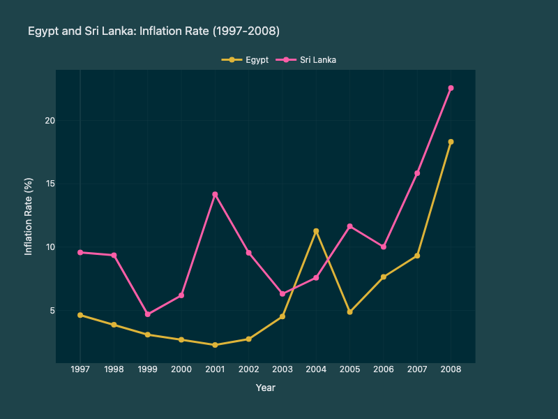
Chart B (Right)
Comparison Summary: Across both periods, Egypt and Sri Lanka show generally moderate inflation punctuated by occasional spikes, but the earlier period is more volatile overall, especially for Sri Lanka. From 1970–1981, Egypt rises from low single digits to a late surge in 1980 before easing in 1981, while Sri Lanka swings much more sharply, dropping to near 1% in 1976–1977 before jumping above 12% in 1978 and peaking at 26.15% in 1980. In 1997–2008, Egypt is comparatively stable at low inflation through the late 1990s and early 2000s, then trends upward after 2003 to 18.32% in 2008, whereas Sri Lanka remains consistently higher than Egypt in most years and shows repeated double-digit readings, notably in 2001, 2005, 2007, and 2008. A key difference is that the first period features deeper troughs and more abrupt reversals, especially for Sri Lanka, while the second period shows a clearer upward inflation trend for both countries toward 2008. Overall, Sri Lanka tends to have higher and more erratic inflation than Egypt in both datasets, with both countries ending each period with elevated inflation.

Chart A (Left)

Chart B (Right)
Comparison Summary: A comparison of cloud cover between Paris and Ho Chi Minh City across two periods in 2022 reveals distinct volatility patterns and seasonal shifts. In mid-March, Paris experienced extreme fluctuations, with cloud cover plummeting from a near-overcast peak of 97.6% to a low of 8.8%, while Ho Chi Minh City remained relatively stable between 43.9% and 63.4%. Conversely, during the late June to early July period, Ho Chi Minh City experienced an overall increase in cloudiness, trending upward to a peak of 81.0% on July 1. Paris continued to show high atmospheric volatility during this summer timeframe, oscillating wildly between a low of 23.2% and a high of 92.8%. Overall, while Paris consistently demonstrated erratic, sharp shifts in both timeframes, Ho Chi Minh City transitioned from moderate, consistent cloud cover in the spring to much cloudier conditions in the summer.

Chart A (Left)

Chart B (Right)
Comparison Summary: A comparison of Cape Town’s weather distributions reveals a clear transition toward drier and brighter conditions between the June-August 2022 and September-December 2022 periods. The most notable shift is the significant decline in rainy days, which dropped from 37.7% in the earlier period to 24.5% in the later months. Concurrently, partially cloudy conditions surged to become even more dominant, increasing from a 48.2% share to 61.8%. Clear days also experienced a slight uptick, rising from 11.4% to 13.7%. Additionally, while overcast conditions made up 2.7% of the weather in the first period, they disappeared entirely from the distribution during the latter timeframe.

Chart A (Left)

Chart B (Right)
Comparison Summary: Between 1980 and 1990, India’s imports were relatively stagnant, with absolute values growing modestly from $17.23 billion to $27.13 billion and the import share of GDP dipping mid-decade before recovering to 8.45%. In stark contrast, the 2000 to 2010 period exhibited explosive growth, with absolute imports surging from $65.12 billion to nearly $450 billion. Similarly, India’s imports as a percentage of GDP nearly doubled during the 2000s, climbing rapidly from 13.9% in 2000 to a peak of 29.27% in 2008. While the 1980s data shows mostly flat trends with only mild late-decade growth, the 2000s dataset reveals a powerful upward trajectory that was only briefly interrupted by a minor contraction in both metrics in 2009. Ultimately, the comparison illustrates a massive shift in economic scale, highlighting India’s drastically increased integration into global trade during the 2000s compared to its low import reliance in the 1980s.

Chart A (Left)

Chart B (Right)
Comparison Summary: A comparison of stock trading volume shares between October 7, 2020, and December 8, 2021, reveals a dramatic shift in market focus among the five observed entities. Most notably, ZM dominated the trading volume in 2020 with a massive 50.1% share but experienced a steep decline to just 19.0% by late 2021. Conversely, JNJ and LULU absorbed much of this redistributed volume, with JNJ’s share surging from 16.8% to a leading 27.5%, and LULU’s more than doubling from 9.7% to 23.9%. LMT also saw a notable increase, nearly doubling its share from 6.5% to 12.8% over the same period. Meanwhile, BMY was the only remarkably stable stock in the group, maintaining a consistent share of roughly 16.8% across both dates.